Branding
Customize AuthKit to fit natively with your app's unique design.
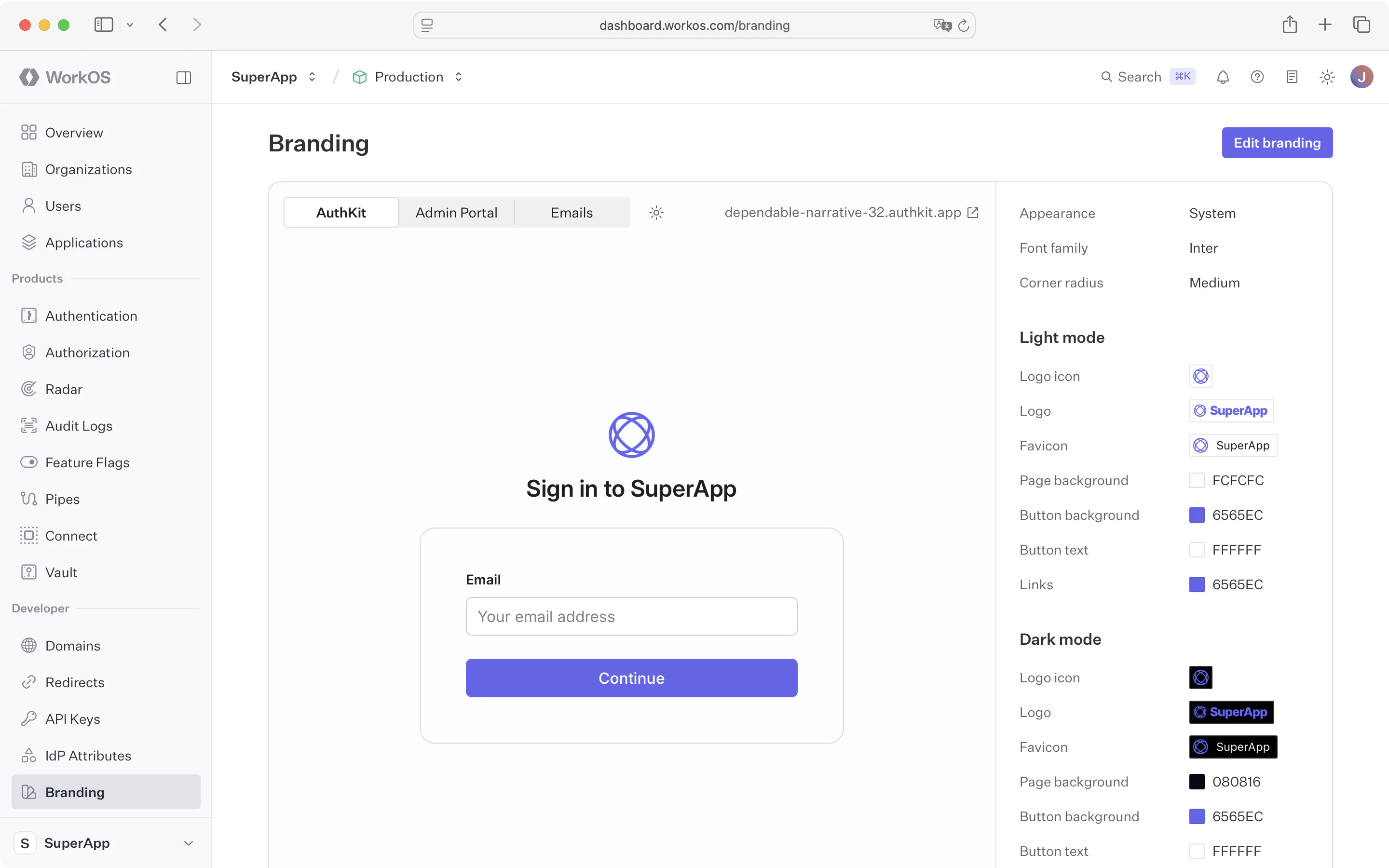
You can customize the look and feel of AuthKit via the Branding section of the WorkOS Dashboard.
The brand editor allows you to:
- Upload logos and favicons
- Set brand colors for buttons, links, and backgrounds
- Manage visual properties such as page layouts, corner radius, and dark mode appearance
- Include custom copy, images, and links to your app’s terms-of-service and privacy policy
- Preview auth screens and emails in various languages, and translate custom text into every supported locale
The AuthKit preview will update in real-time as you make changes and accurately reflect the available authentication methods, giving you a clear picture of the authentication experience with AuthKit.
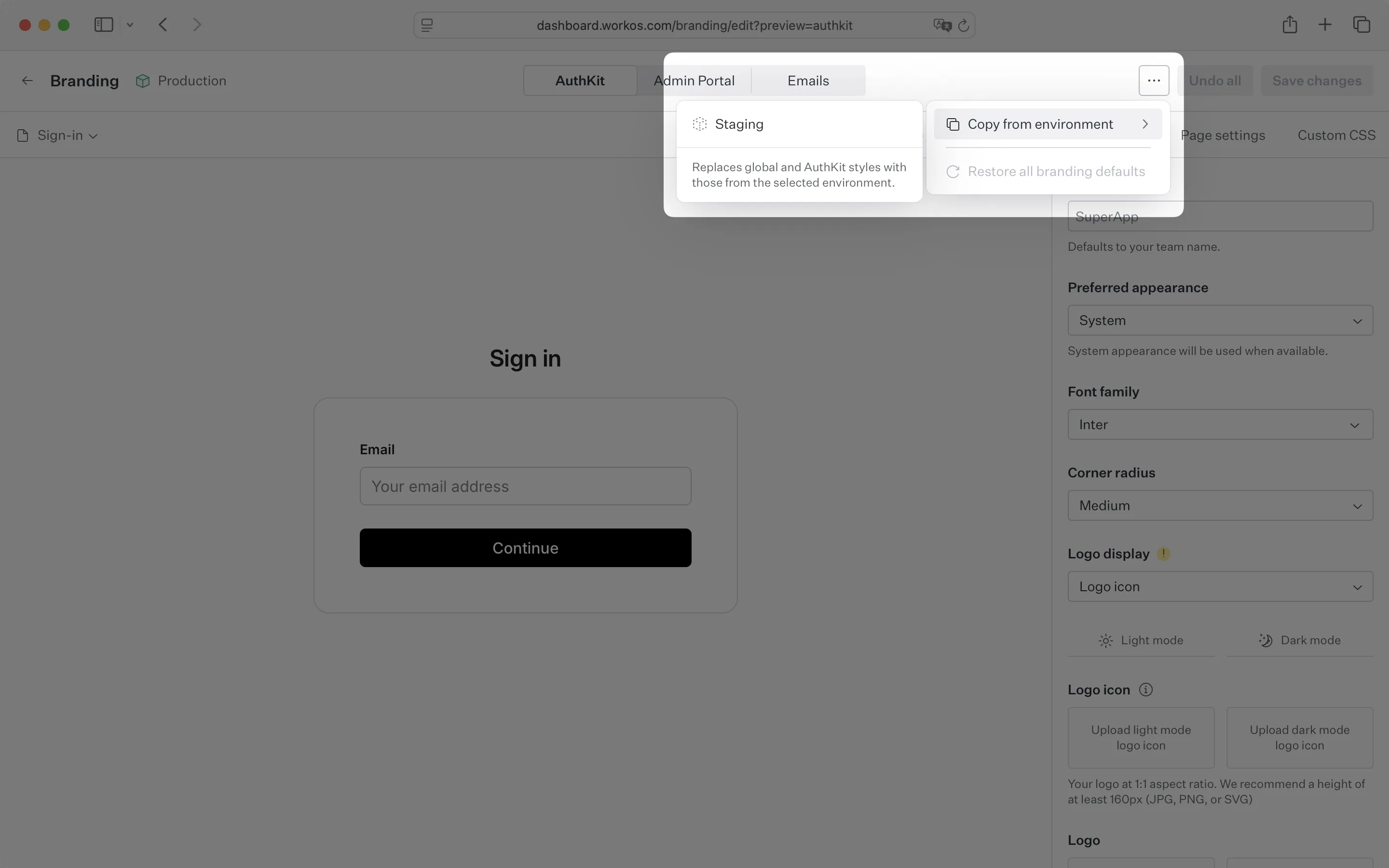
Branding is configured per environment, so each environment has its own logo, colors, and theme. A staging environment can look different from production, and each project (a grouping of environments for one product) can present its own brand.
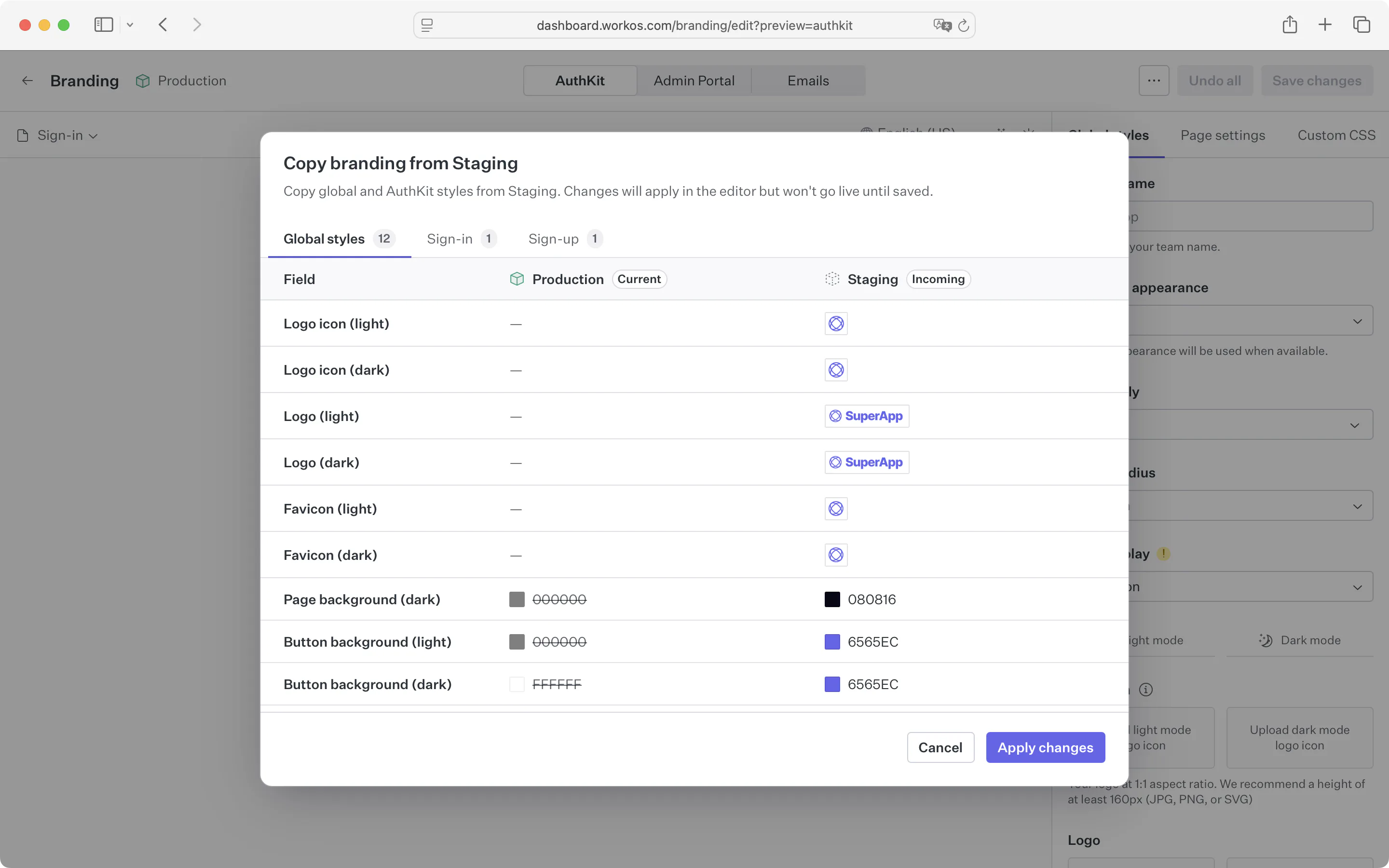
To avoid setting up branding from scratch in a new environment, copy it from an existing one. WorkOS loads the copied logo, colors, theme, and other settings into the brand editor before saving, so you can adjust anything before it goes live. This is useful for testing a branding change in staging before applying it to production.
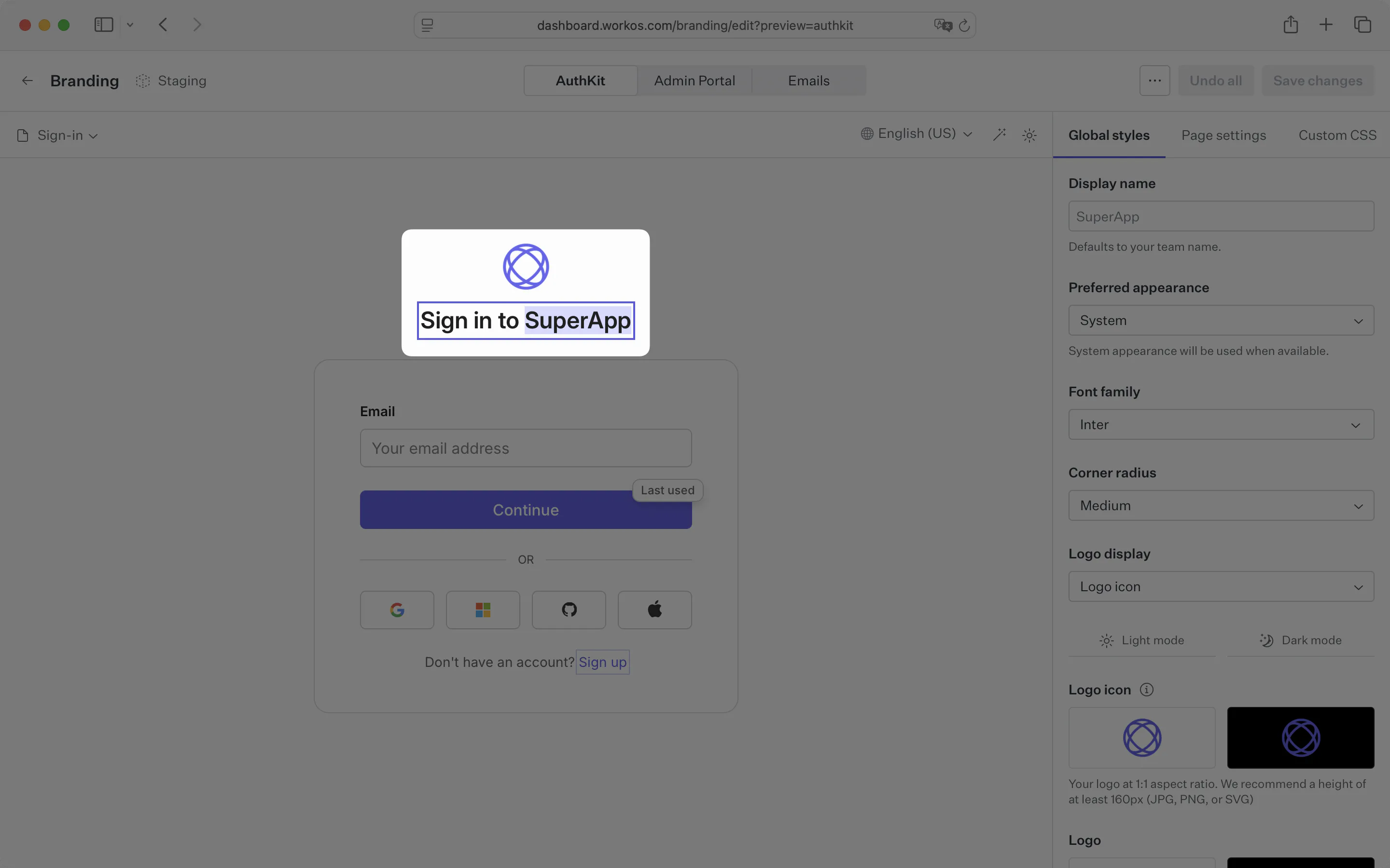
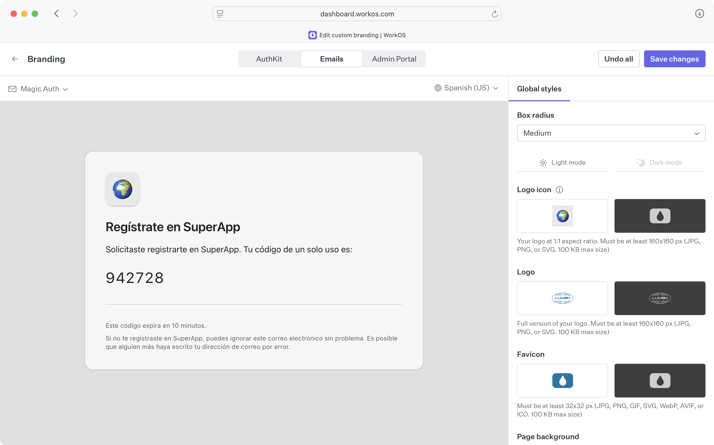
Global styles define your brand’s visual identity and apply across AuthKit, transactional emails, and the Admin Portal.
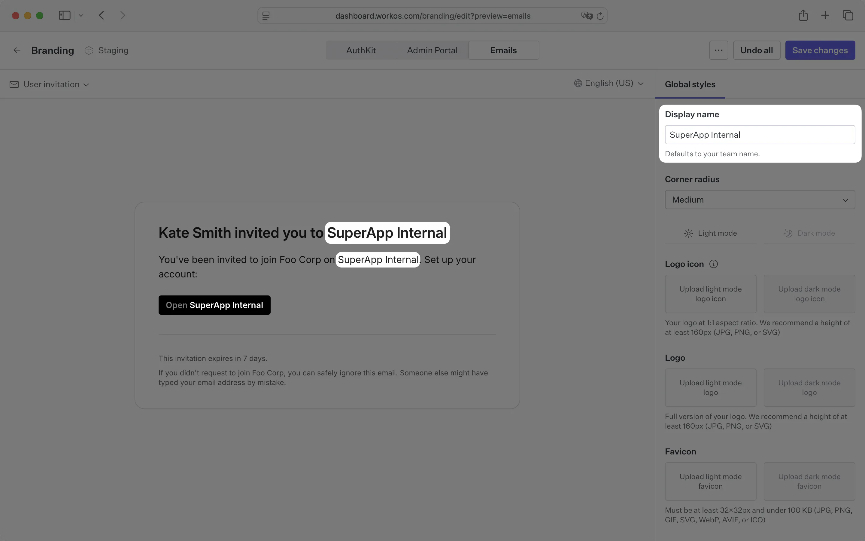
The display name controls the product name shown to your users. It defaults to your team name, but can be customized to more accurately reflect your product name. It appears in the following surfaces (may not be an exhaustive list):
- AuthKit: User invitation acceptance and Waitlist pages
- Transactional emails: User invitation, Magic Auth, email change, Waitlist confirmation, Radar notification, and Radar challenge emails
- Admin Portal: Organization setup page and Domain Verification, Single Sign-On, Directory Sync, Log Streams, and Bring Your Own Key setup flows
The corner radius applied to UI elements can be configured; a lower value results in a more formal aesthetic while a higher value has a more rounded, playful feel.
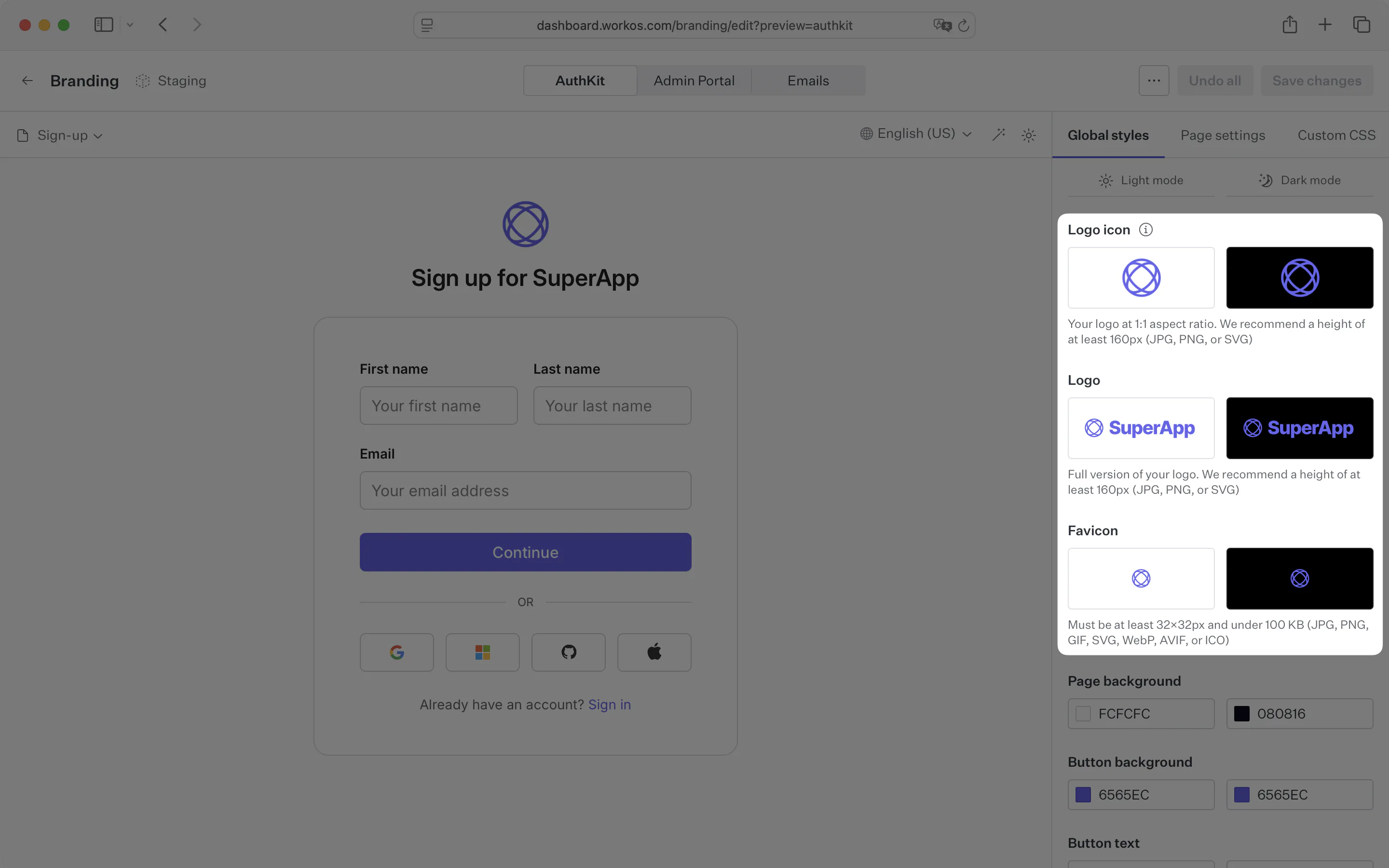
There are three types of assets you can upload:
- Logo: Your full size brand logo, styles vary but this would typically include the wordmark. Must be at least 160x160 px (JPG, PNG, or SVG. 100 KB max size)
- Logo icon: A smaller, square version of the logo. This is often simply the logomark. Must be at least 160x160 px with a 1:1 aspect ratio (JPG, PNG, or SVG. 100 KB max size)
- Favicon: A small icon that serves as branding for your website. It is often displayed in the browser tab alongside the address bar. Must be at least 32x32 px with a 1:1 aspect ratio (JPG, PNG, GIF, SVG, WebP, AVIF, or ICO. 100 KB max size)
You can control four colors across light and dark mode:
- Page background color
- Button background colors
- Button text color
- Link color
Other colors used in the UI, like the focus outline, hover styles, or borders, are created automatically based on the four colors you provide, ensuring a consistent look and feel.
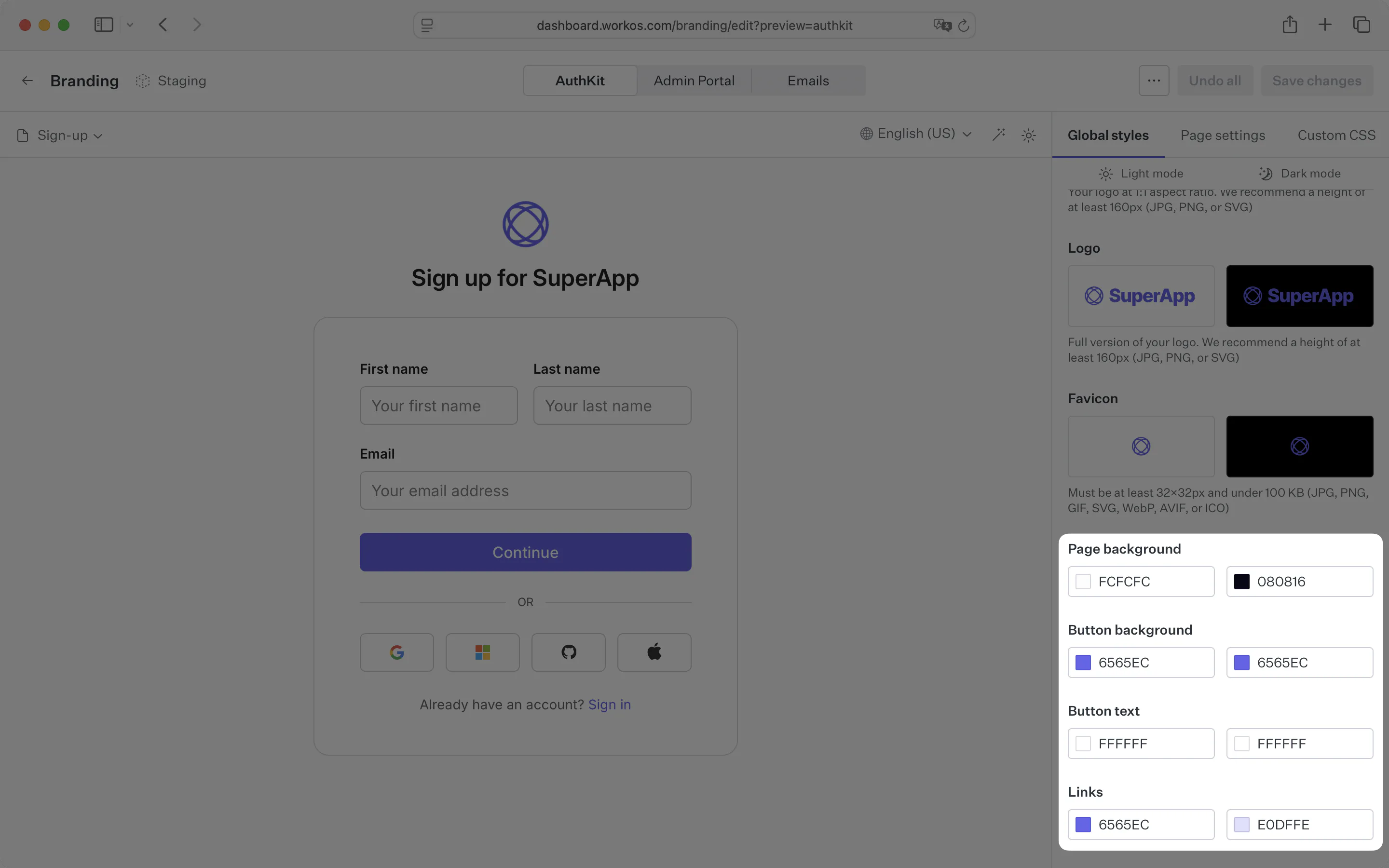
AuthKit supports both light and dark mode; each brand configuration option is split across both so that they can be configured independently. You can enforce a specific appearance, or allow the user’s OS system settings to determine which to use.
You can customize the font family used across AuthKit pages to match your brand’s typography. The font family selector allows you to choose from a wide variety of Google Fonts to align with your product’s brand. Only Google Fonts are supported for font family customization. This ensures optimal loading performance and reliability across all devices and browsers.
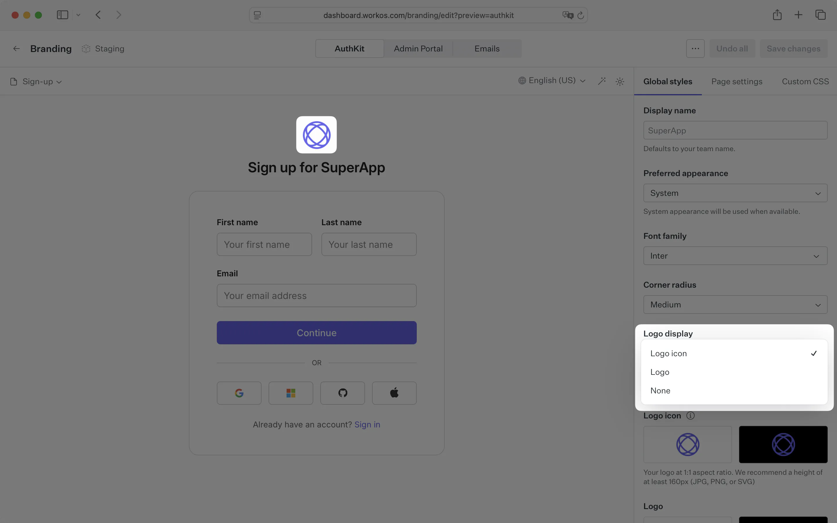
AuthKit can display your full logo, just the logo icon, or no logo at all, selected from the Logo display dropdown. Showing the logo or logo icon requires the corresponding asset to be uploaded.
The page title, sign-in link text, and sign-up link text on the sign-in and sign-up pages can be customized to fit your brand’s tone of voice. They can be edited directly inside the AuthKit preview pane.
Start by selecting the page you want to edit. Then, click on the text you want to change from the preview pane.
When you edit copy in English, it automatically gets translated into every supported language. A loading indicator appears next to the language picker during this process. After you save, your users will be served the translation that closest matches their locale.
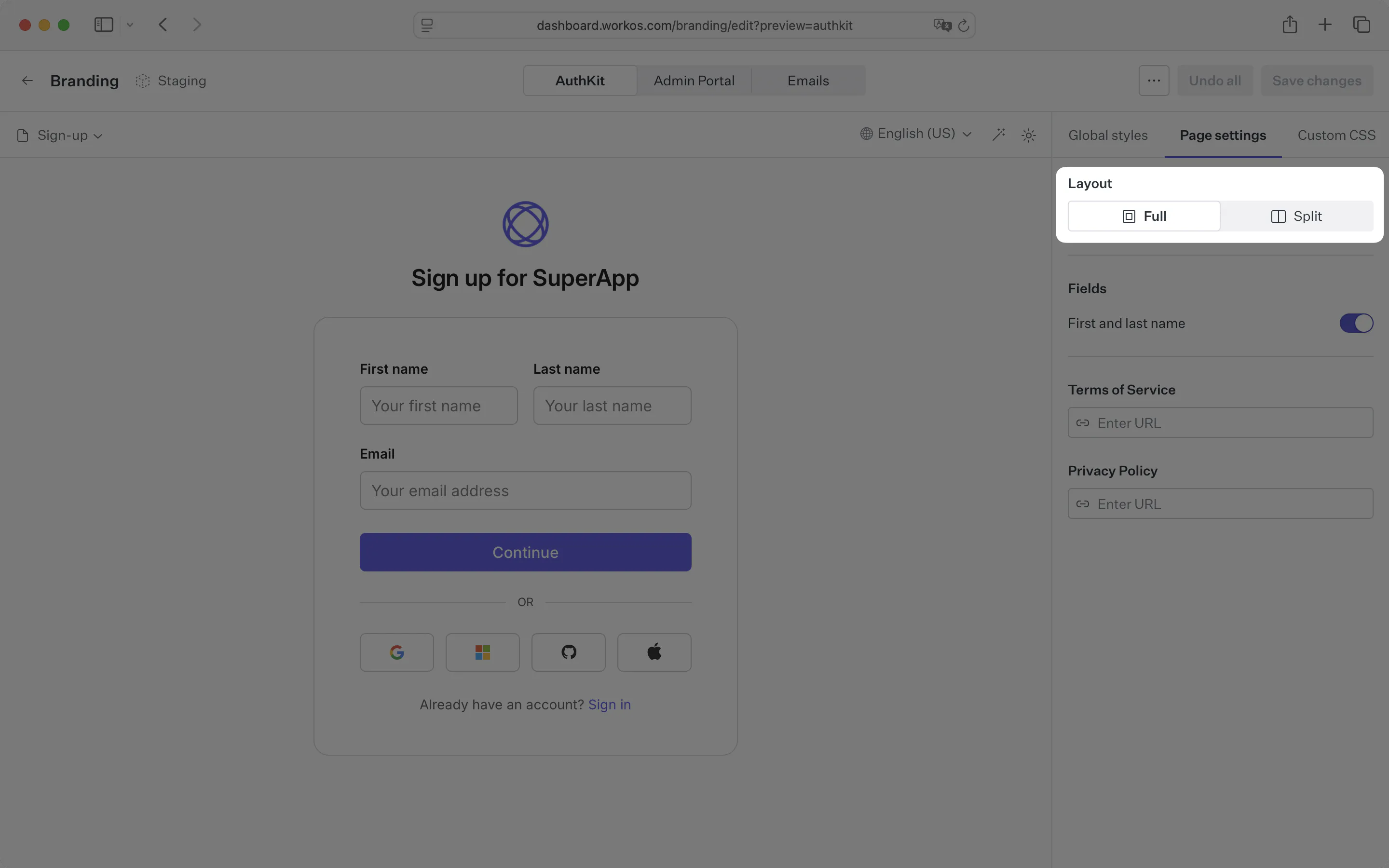
The layout for sign-in and sign-up pages can be customized to fit your brand’s needs. Choose a layout in the Page Settings panel: a centered, one-column layout, or a two-column split layout with a secondary content panel you customize using custom HTML and CSS.
The split layout’s content panel is useful for marketing content or decorative elements. To set one up, select the page you want to customize and choose the Split option. The panel can be positioned to the left or right of the primary panel, and optionally hidden on mobile devices.
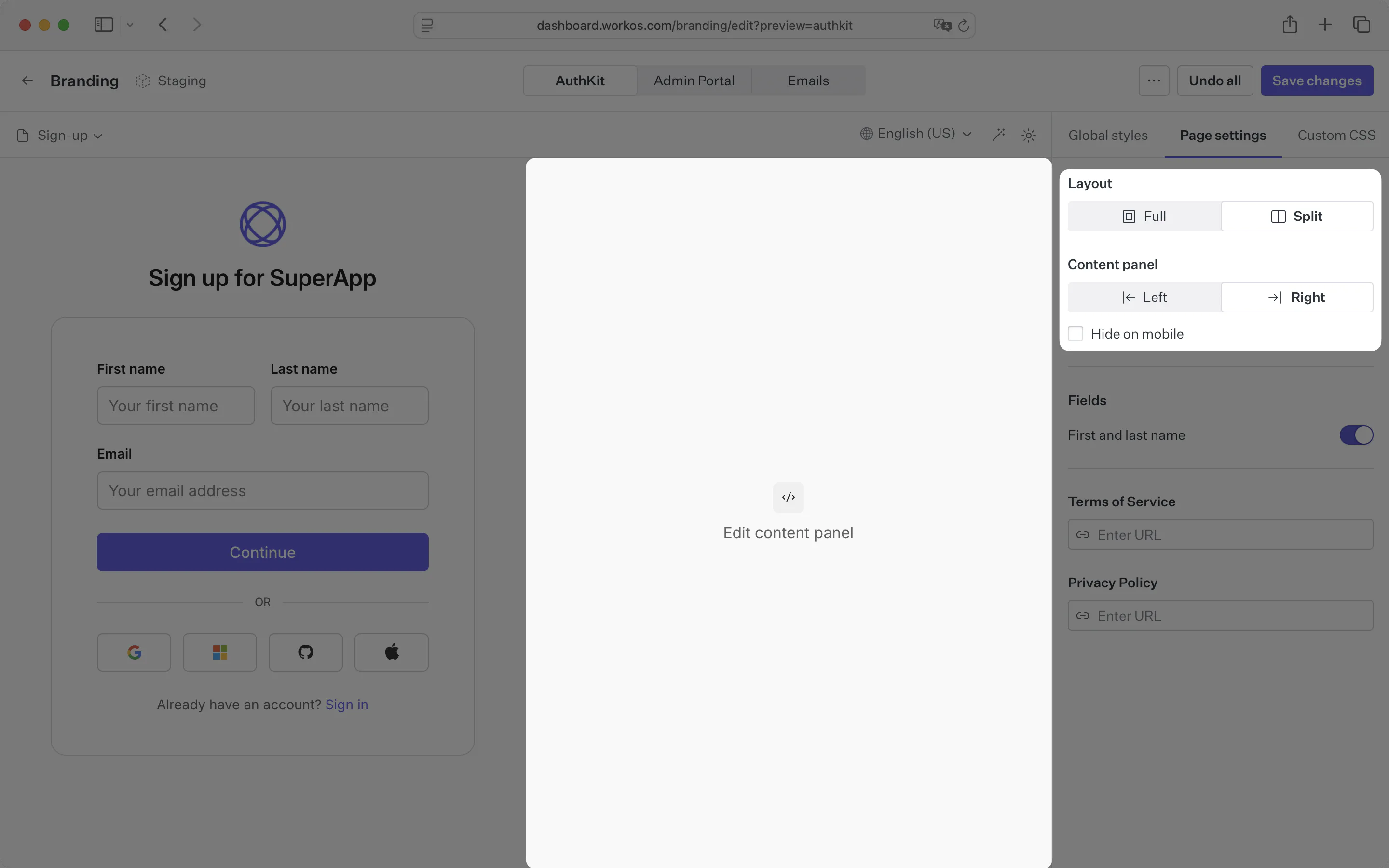
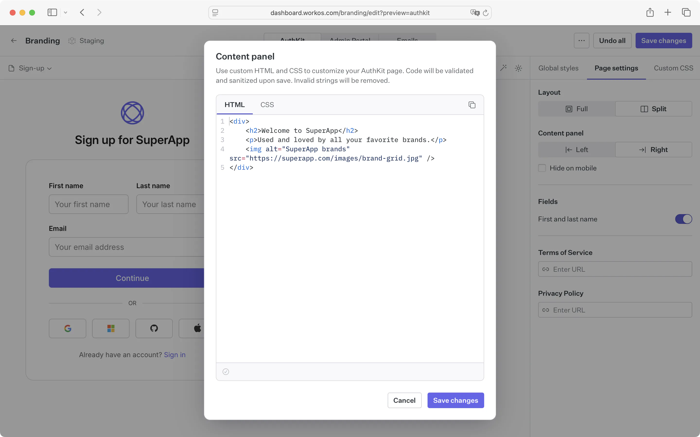
Click the content panel in the preview pane to open a dialog where you can enter your HTML and CSS.
Content panel details and limitations
Any HTML and CSS entered into the content panel dialog will only be applied to the content panel on the selected page. This allows you a high level of flexibility without impacting content elsewhere on the page.
For security purposes, all code input is sanitized and stripped of any potentially harmful elements. This means that you can’t use JavaScript or any other dynamic content in your HTML. This includes script, iframe, form, and object elements – as well as inline event handlers for any elements.
For example, the following code will be sanitized from this:
…to this:
HTML style elements will also be removed to prevent overriding any content outside of the content panel. All custom CSS should be entered into the CSS editor.
CSS selectors will be scoped to the content panel via CSS nesting. For compatibility with older browsers, we use a light transform step to convert the nested CSS to a flat structure.
For example, the following CSS will be transformed from this:
…to this:
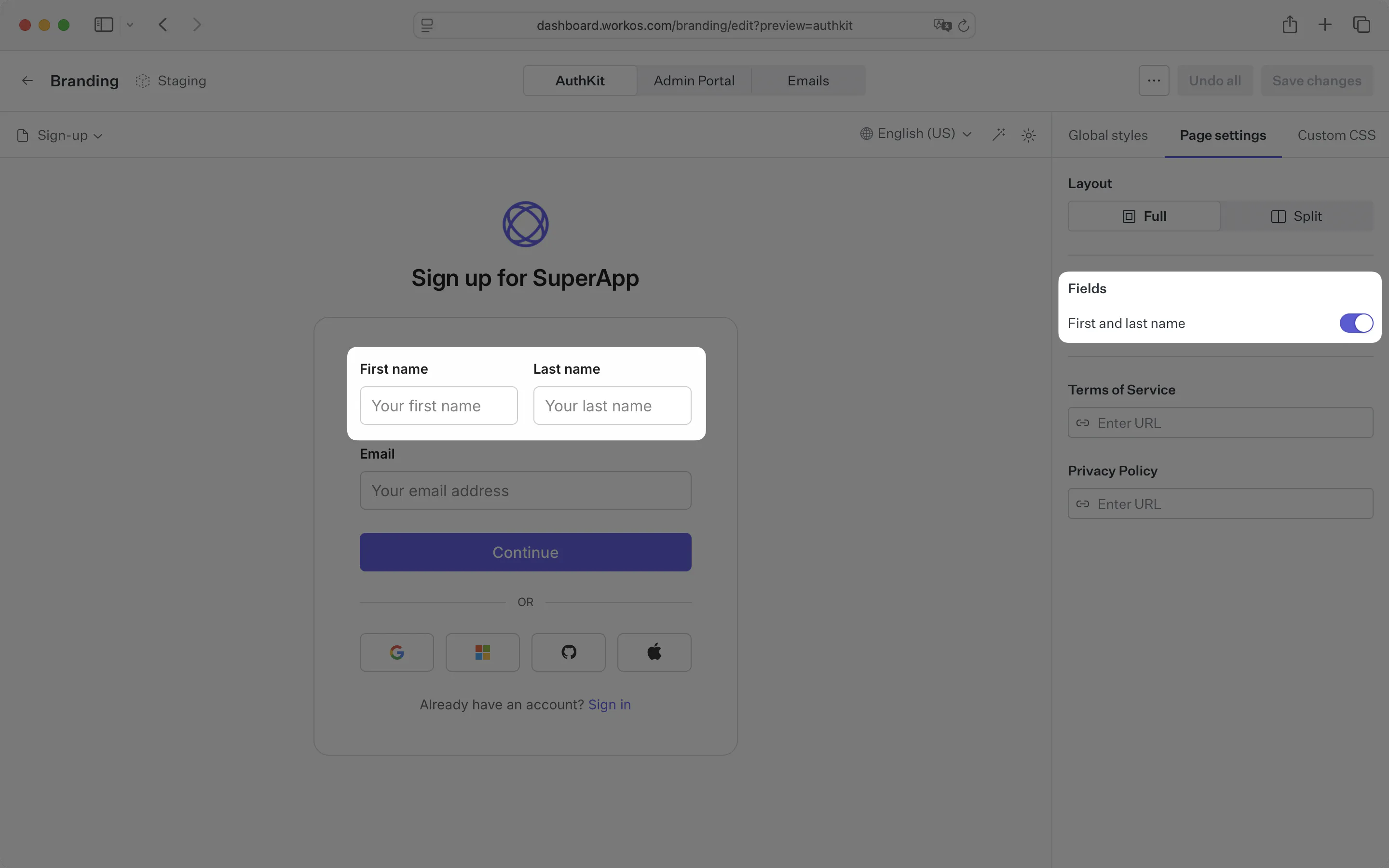
The sign-up form can optionally include first and last name fields, toggled in the Page Settings panel.
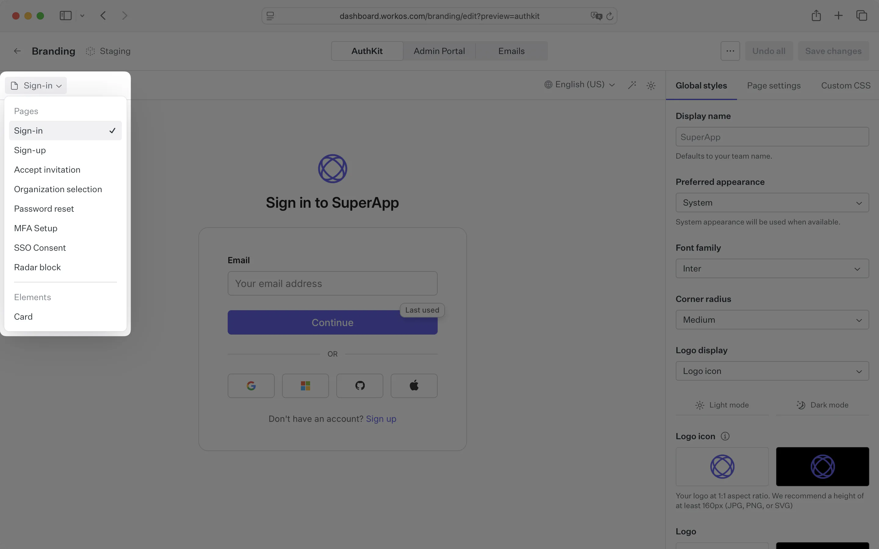
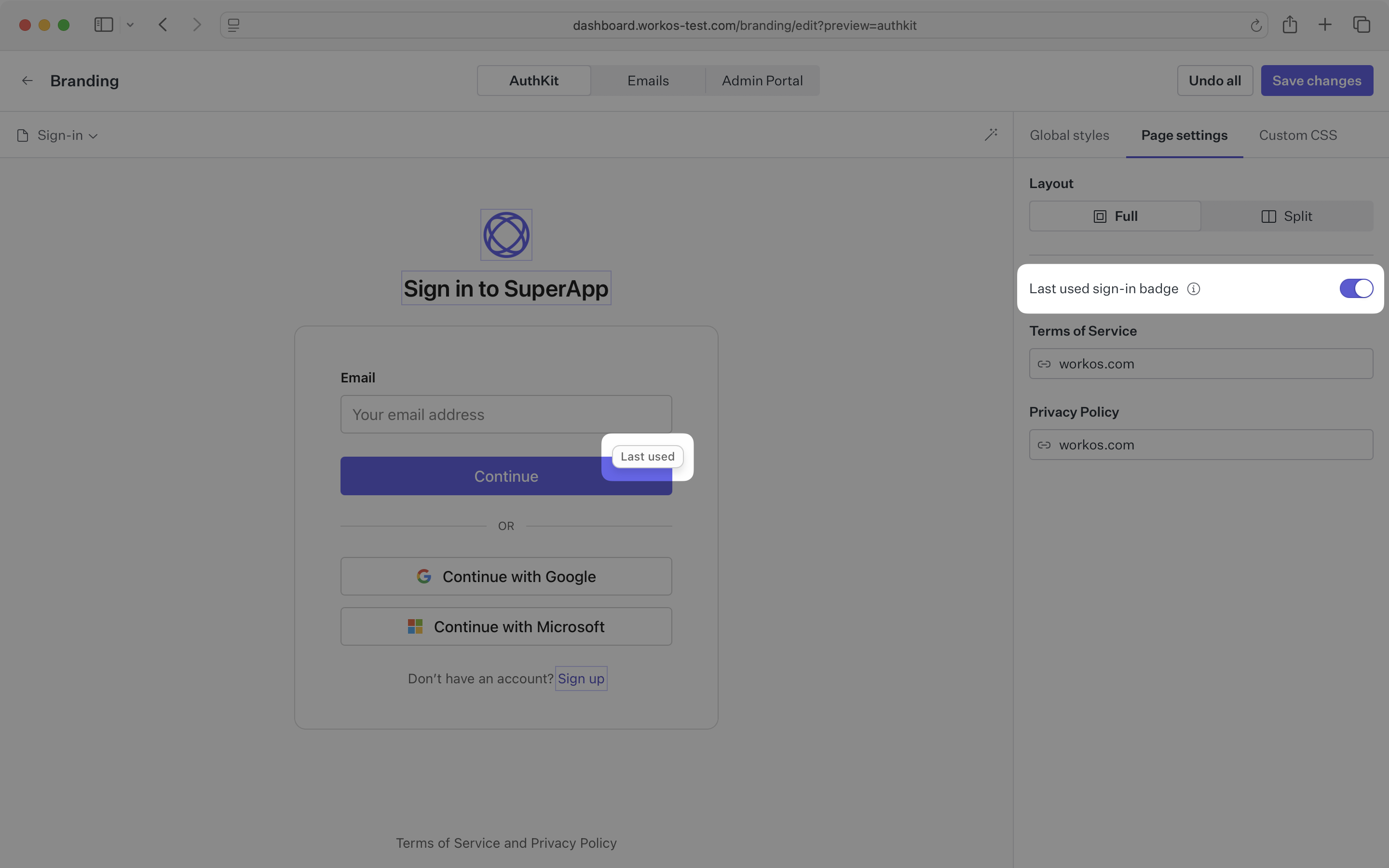
The sign-in page can optionally display a Last used badge on an authentication method. This will indicate the most recent sign-in method for the user. The badge is shown by default and only shown when multiple sign-in methods are available.
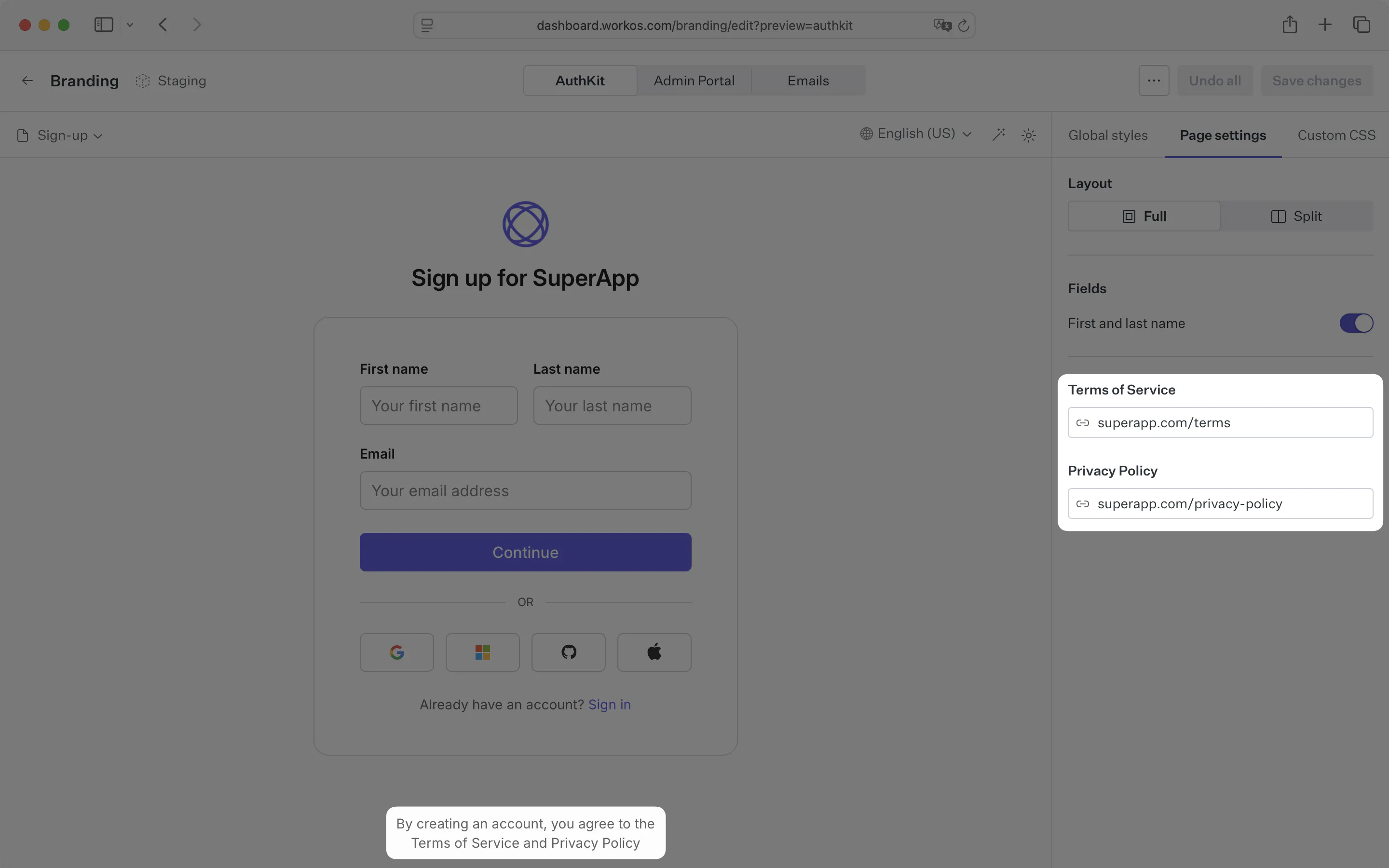
The sign-in and sign-up pages can optionally display a link to your app’s privacy policy and/or terms-of-service, shown below the authentication form. This can be configured in the Page Settings panel.
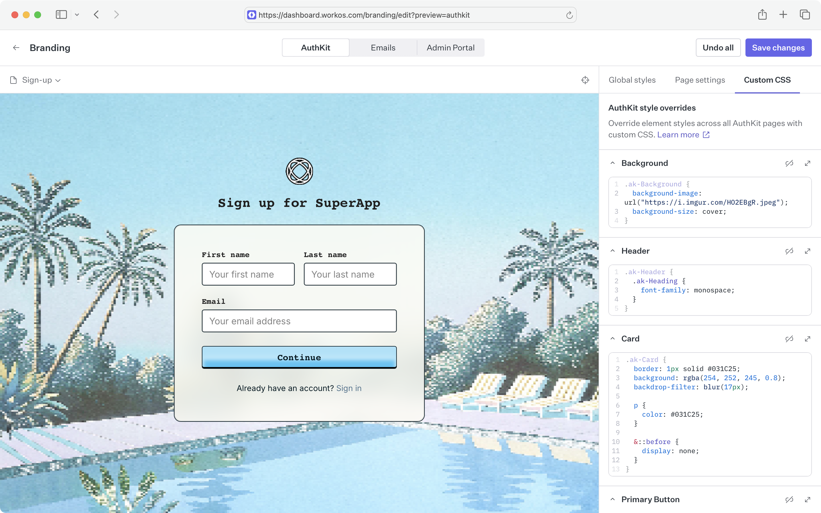
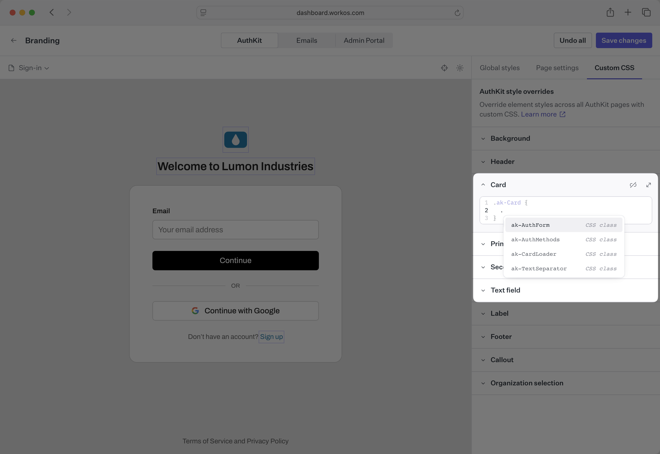
For more granular control over AuthKit branding, element styles can be overridden using custom CSS. Custom CSS applies globally across all AuthKit pages to ensure consistency across the entire authentication experience. It does not affect emails or Admin Portal.
Target specific pages using the data-hak-page attribute selector:
sign-in- Main sign-in page
sign-in/password- Password-based sign-in
sign-in/passkey/enroll- Passkey enrollment during sign-in
sign-up- Main signup page
sign-up/password- Password-based signup
sign-up/passkey- Passkey-based signup
sign-up/magic-auth- Magic link signup
sign-up/registration- Custom registration form
oauth- OAuth provider selection
magic-code- Magic code verification
magic-code/send- Magic code request form
mfa/enrollment- MFA setup/enrollment
mfa/verification- MFA code verification
email-verification- Email verification page
radar-challenge- Fraud detection challenge
radar-challenge/send- Phone number input for SMS challenge
radar-challenge/verify- SMS verification code input
invite- Invitation acceptance page
reset-password- Password reset flow
organization-selection- Organization picker
device- Device activation page
device/success- Successful device connection
device/denied- Device connection denied
application-authorization- App consent/authorization page
default-redirect- Default redirect after successful auth
not-found- 404 error page
auth-disabled- Authentication disabled message
Use the light-dark CSS function to easily target both light and dark themes with a single declaration:
For more control, target the parent theme selectors directly:
prefers-color-scheme are not supported – use only the .dark-theme and .light-theme selectors.
AuthKit provides intelligent autocomplete support for CSS selectors. When you type a period (.) in the custom CSS editor, a popover will automatically appear showing available nested selectors for AuthKit elements, making it easier to target specific components and their child elements.
Custom background image
You can use external images as background images by specifying the URL in the background-image property.
Reorder OAuth buttons
You can target an individual provider button by its data-method attribute.
Adding custom text
Use CSS pseudo-elements to add custom text content.
Custom text content in CSS cannot be localized. To learn how to automatically localize the text of your custom headings and links, read the custom copy section.
::before and ::after pseudo-elements, so test your changes carefully.
You can preview how your auth pages and emails appear in various different languages. AuthKit is localized in many languages by default, and users are served in their preferred language automatically.
To preview your brand in different languages, use the language picker in the AuthKit preview pane.
WorkOS supports custom domains for both email and ACS URLs. For information, see the custom domains documentation.